
Roadmap Ready | Using timelines in graphic facilitation
Click and read on to learn:
- Live creation of timelines that don't bite you in the backside later
- How timelines give shape and orientation to your chart
- Why basic is better
- Building layers of information as the conversation progresses
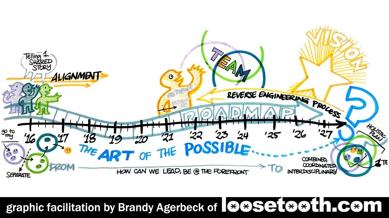
Supporting a leadership team in a strategy session with a long-term goal, a timeline is a solid start. As a graphic facilitator, I am drawing a six-foot wide and four-foot tall drawing for the group for this 90 minute session.
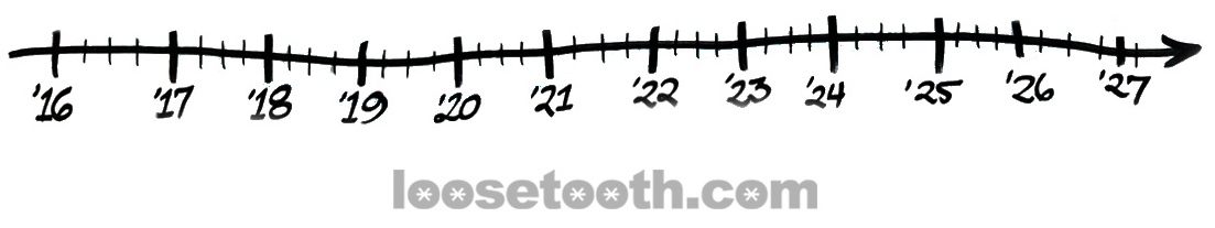
I start with a timeline.
Radical.
I know.
From nearly 20 years of experience, timelines are often evoked at the beginning of a meeting as the T in the group's SMART goals. I've also seen timelines not remarked about again.
Still, I like plunking down a timeline for 3 reasons:
- A timeline signals progress
- It makes something ephemeral tangible and it tether the group to some sense of time
- I now have split my chart into useful areas
On the third point, I now have current time on the left, meeting the future vision on the far left, and plenty of space in between. I also have above and below the timeline. More on that later.
Note: The timeline is a bit wobbly because I took several steps to draw it about five-feet long. I like that is implied a bit of bumpiness, not smooth sailing. But that's the result, not the intent.
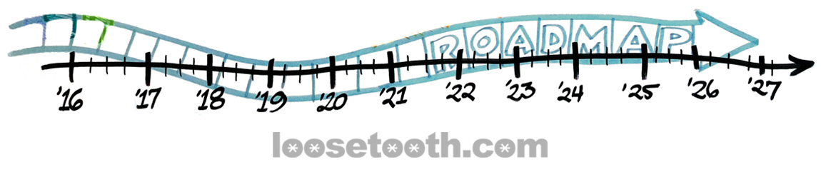
The leader in the group talks about their need for a roadmap. This is a buzzword that could range anywhere from wishful thinking, to a doorstop-sized detailed document.
As an outsider, I don't know.
This is how I capture this mention of a roadmap:
How radical!
I know.
Notice that I chose a big wide arrow split into sections. More sidewalk than road.
I do not draw a literal road. No yellow lines down the cemter. No asphalt to fill in.
For graphic recorders who come into the work from the art world, their ears may perk up and fingers may start twitching.
"Oooh, I can draw a road and then I can use road signs for milestones, and those barricade thingies as obstacles, and..."
And now they are filtering everything the participants say through their metaphor. In a passing mention of a physical object, the visual notetaker now stops being present and listening.
The group is far past that mention and the graphic recorder is left in the dust.
In moments, I draw a road-ish arrow and keep listening. The segments give me spaces for phases or steps in their process.
If there are any discussed.
The goal of this session, within a multi-day meeting, is to clarify their vision and discuss how the group will move forward as a team and as leaders.
They discuss defining their goals and then reverse engineering the process to get there. I draw: 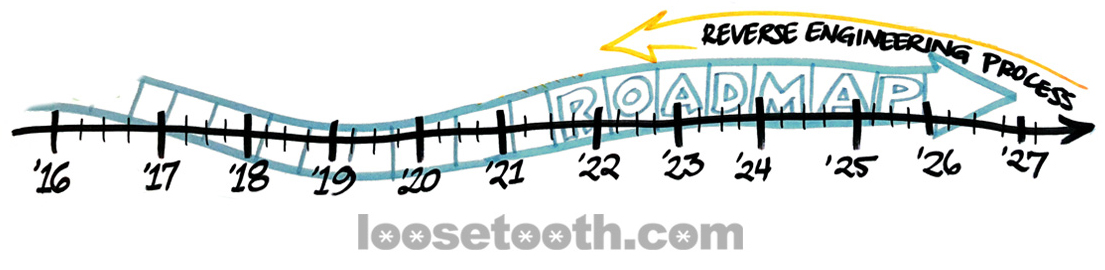
This Brandy Agerbeck, she is SO radical.
I know.
That yellow arrow is fast and simple. It is draw in reverse. It captures the point.
Next, I draw images that represent the team now and what they are moving towards: 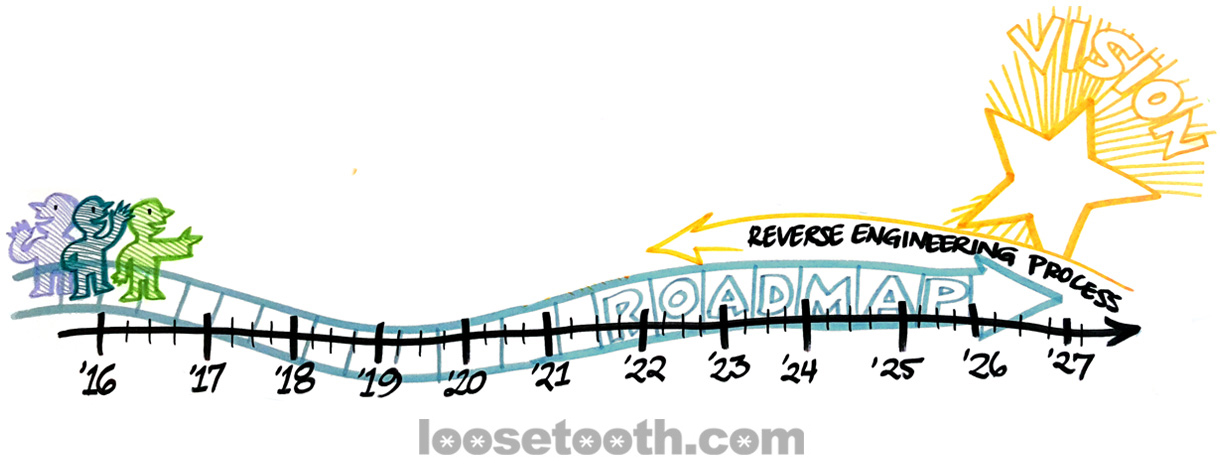
On the left in three figures as stand-ins for three types of people who are working together. They are color-coded aligned with charts drawn and discussion had early in the event.
On the right, a big ol' star. Bless stars for being a basic symbol of light, good, and goals. We haven't gotten clear on the vision, so I don't have a more detailed way to draw it.
Having the trio of peeps on the left gives me a place to capture how the group is going to work together:
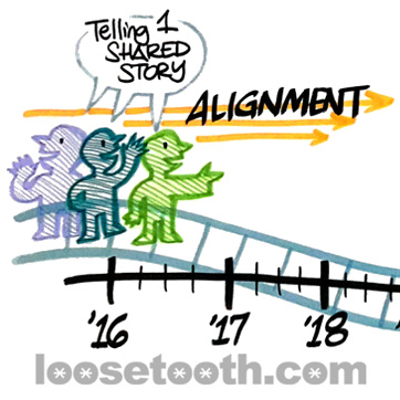
I can always add onto this area as these ways of working come up live.
The group keeps referring back to this principle of The Art of the Possible (perhaps the book?). With the repetition of the phrase, I add it stretched along the whole timeline and roadmap: 
As the conversation continues, I'm picking up patterns in what wasn't working -- Before -- and the changes the group wants to make -- After.
I synthesize the Before and After of team dynamics with trusty Venn diagrams: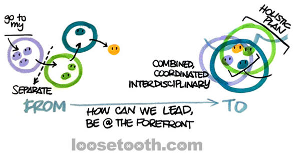
I truncate the line here for legibility. I have a very natural place for these two states at the very bottom of the chart.
Speaking of, here's the timeline in context of the entire chart: 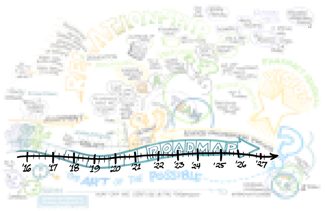
See how I started the chart with the line about three-quarters down the page? With space to the right of the arrowhead?
The vertical placement is knowing that timeline may get a tons of use or very little. Let's tuck it down there.
I can add to it when I need it.
If it is not integral, it has a place to hang out.
And as a real-live human making a real-live drawing for other humans, the placement gives me 3/4s of the page to draw the bulk of the conversation comfortably standing and moving. Drawing legible in that lower fourth means kneeling or crouching.
If you are a new visual practitioner working live at walls, you'll see how physically taxing the work is. Standing for hours, moving, reaching up, crouching down.
I hope reading through this single example will make you more roadmap ready on your next project.

